
Modern Home Pages
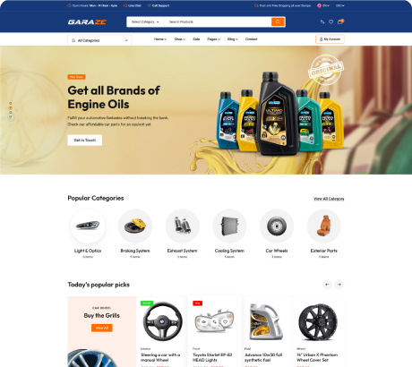
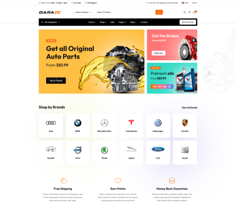
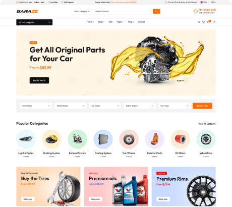
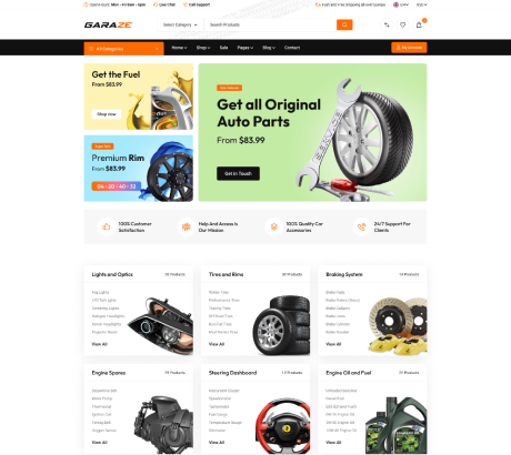
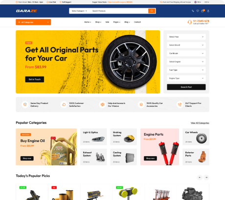
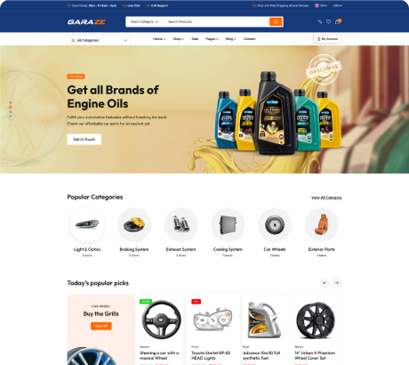
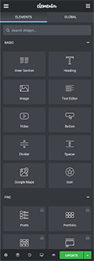
The Drag & Drop Elementor Page Builder
Power your vision with Elementor to build, manage and host stunning websites! We’ve got you covered from A-to-Z with the #1 website platform for WordPress.
Visualize & build your website from top to bottom. Drag & drop any widget or section onto your canvas - zero coding required.
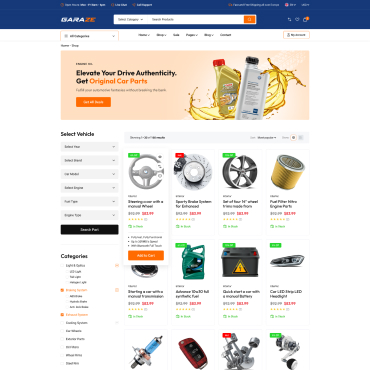

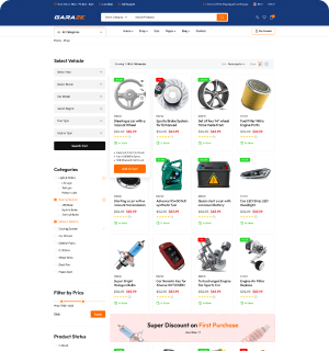
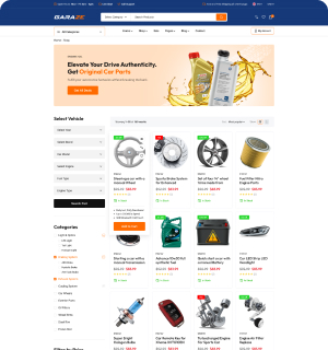
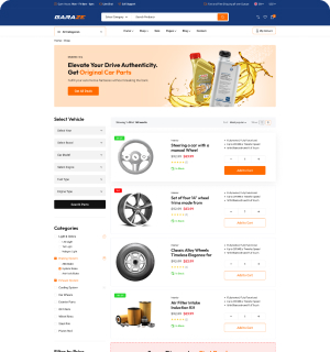
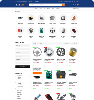
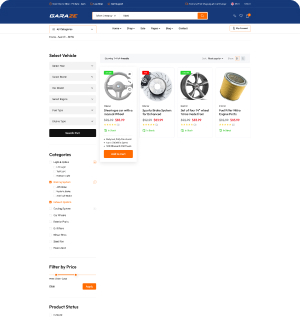
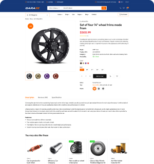
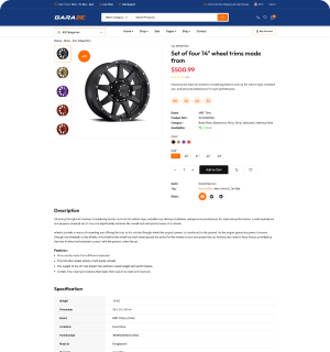
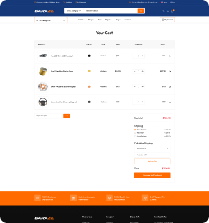
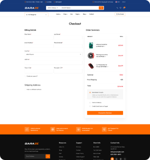
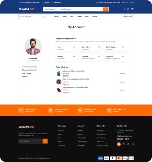
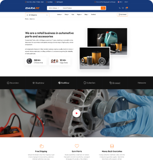
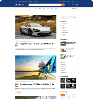
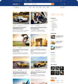
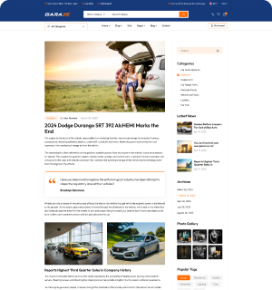
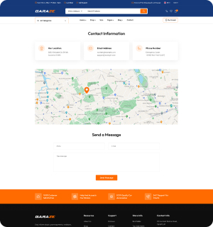
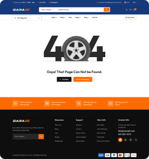





5 creative header style pushes the boundaries of conventional
We offer a diverse range of five distinct header styles, each meticulously crafted to suit various preferences and design needs. Our header styles are thoughtfully designed to enhance the visual appeal and functionality of your website or application.
From modern and minimalist to bold and eye-catching, our selection ensures there's a perfect fit for every project.
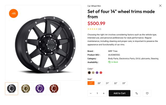
Quick View option is designed to enhance user experience
This functionality typically involves a clickable button or icon associated with each product thumbnail or listing. When clicked, a modal or pop-up window appears, displaying the relevant details in a condensed and easily digestible format. Users can quickly assess the product and make informed decisions without interrupting their browsing flow.
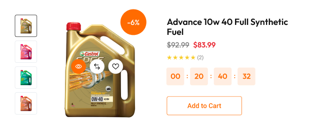
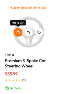
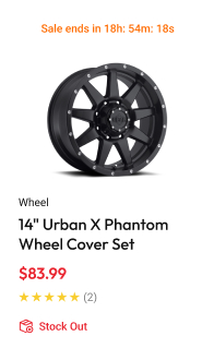
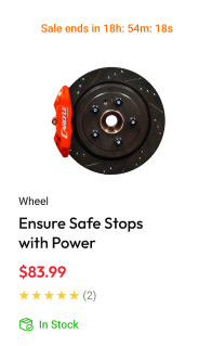
Today's Best Deal is a curated selection of exceptional offers
Displayed prominently on the website's homepage or designated deal page, the "Today's Best Deal" section typically includes enticing visuals, such as eye-catching product images or attention-grabbing banners, accompanied by a brief description of the product and its discounted price.
Additionally, it may incorporate elements such as countdown timers or limited stock indicators to create a sense of urgency and encourage immediate action.
Ads section are often placed in highly visible locations
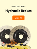
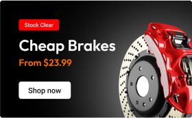
The e-commerce ads section is a dedicated area within an online marketplace or e-commerce platform where advertisements for products or services are prominently displayed.
This section serves as a strategic marketing tool for both sellers and the platform itself, allowing businesses to promote their offerings to a targeted audience while generating additional revenue for the platform through advertising fees.





Well instructions for installing & setting up the template
Well-documented web templates are an essential asset for developers, designers, and users alike, providing comprehensive guidance and instructions for effectively utilizing and customizing the template to meet specific project requirements.
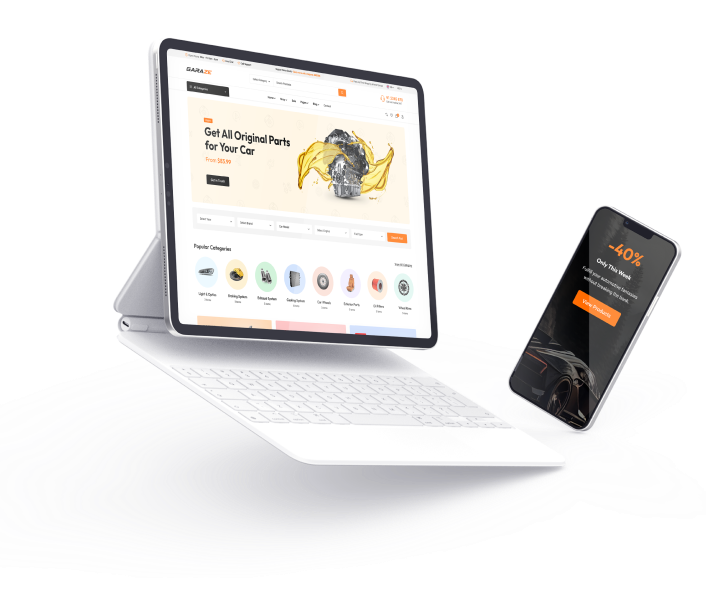
Responsive designs incorporate friendly navigation & interactive elements
A fully responsive design is a web design approach that ensures a website's layout and content adapt fluidly to fit various screen sizes and devices, providing an optimal viewing experience for users across desktops, laptops, tablets, and smartphones.
This adaptability is achieved through the use of flexible grids, images, and CSS media queries, allowing the website to dynamically adjust its appearance based on the dimensions and capabilities of the user's device.
Compatible with Powerful Premium Plugins

Mailchimp Email

Elementor Builder

WooCommerce Integration

Contact
Form 7

BuddyPress Addons

Yoast SEO Plugin

One Click Installation

Dedicated Support
